Had raised this question a year-and-a-half ago, when the logo was first unveiled (also a couple of times since).
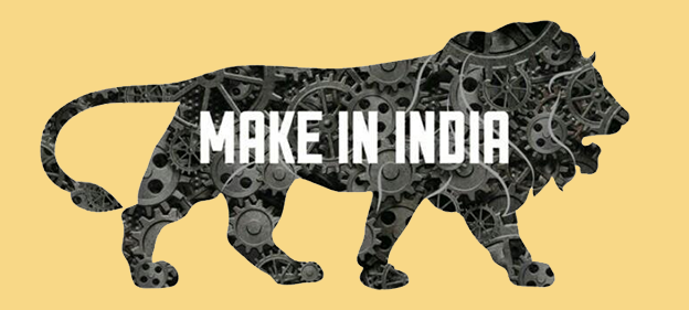
There was quite a brouhaha over the news that the Make in India logo was designed by the Indian arm of foreign company (which is actually in sync with the idea behind Make in India) but almost no one appears to have raised an eyebrow over a fundamental error in the design.
It was also brought to the notice that the logo could have been inspired by the design of a Swiss bank campaign.
Given that Make in India is topical again as the Make in India week is on in Mumbai, thought of posting this to highlight something that I believe needs correction.
The lion silhouette used in the Make in India logo is distinctly African, a type that isn’t native to India. The lion in the logo has a much fuller mane than what is found the in the Asiatic lion (also known as Indian lion), the kind native to India (See image below for comparison).
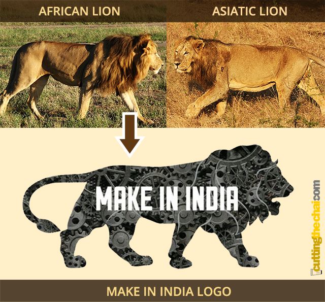
The designers might have thought that a fuller mane adds to the magnificence, but that addition misplaces the thought. Artistic license is no excuse for a mix-up. And this obviously went unnoticed at multiple levels.
It is said to be inspired the national emblem of India, but the lion in the logo is more line the African lion in the image above than any of the lions in the Lion Capital of Ashoka at Sarnath.
It is worth noting that Make in India is one of Prime Minister Narendra Modi’s pet projects and the last remaining home of the Asiatic lion is in Gujarat, the Prime Minister’s home state.
Logos are thought to be be an easy to recognise visual representation of the philosophy behind a project/company. This use of an African lion instead of the Asiatic appears to represent our ignorance.
(African lion image by Swissfrog [CC BY 3.0], via Wikimedia Commons; Asiatic lion image by Bernard Gagnon [GFDL (http://www.gnu.org/copyleft/fdl.html) or CC BY-SA 3.0 (http://creativecommons.org/licenses/by-sa/3.0)], via Wikimedia Commons)

